Accurate representation of currently running items
Animated feedback on currently running items
More visible indicator of which is currently running
Start-up performance; the Window pops up faster thanks for not having to wait for Collectors
Interactivity performance; pressing buttons doesn’t lag anymore
Both family and families are represented in the GUI
Plug-ins only compatible with the Context are more accurately represented.
I’ll be giving you numbers of actual performance gains. Before shipping this, I’d also like to get progress bars involved, but I can’t make any promises.
The primary reason for the improvements have been due to some refactoring and preparation for 1.3 with ContextPlugin and InstancePlugin. I’ll fill you in as I go, hope you like the changes so far and let me know if you have any thoughts!
Thanks. No, they don’t disappear*, but their status is nulled once resetting is done. Maybe it makes more sense to leave them checked, and with their status intact? Would that work for artists? They would still manage to succeed validation and publish things, but have red items in the list of plug-ins.
*The plug-ins that do disappear are those without a compatible instance.
Ok, how about now? Also added some more clarity to which plug-ins is currently running, but decided to leave status bars to the next designer (hint hint).
This! I’ve just finished deploying pyblish in a second studio so I have some fresh feedback from artist seeing it for the first time. They love it (surprisingly good reaction to the change), however they don’t see the point in having collection in the UI. They don’t care for any of the plugins apart from optional validators and extractors really. And all the plugins make it really cluttered.
More to the point of your mockup. The second version looks great. You can clearly tell what’s going on and it shows results nicely. However with the same breath I’ll say, that development on this particular GUI is starting to feel a bit redundant. It should certainly stay in pyblish as the place we go to check what exactly is going on, however what pyblish desperately needs (to be more widely adopted as well I think), is Simple, Pretty UI for the artists who spend the most time with it.
As a TD I appreaciate the hell out of this view. But trust me that I’m the only one I know with that sentiment. For artists it’s just overwhelming seeing all that stuff happening.
Yup, something small and simple that’s not as verbose would really “ease” the use for anyone who doesn’t care exactly how things get run but just want to know what ends up being wrong/failed after publishing.
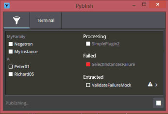
Maybe instead of showing all plug-ins on the right it would only “show” the name of the one that’s currently running (at the top) so you see it processing. And then under it you’d get whatever is failed.
Something like this that just shows less in general. I don’t think artist would know what the Context is, they just care about what’s being processed like Peter01 in it’s A family. Or more descriptive Peter01 of the pointcache family for example.
The idea that I mocked up on the right side here is that at the top it shows Processing... with the current plug-in. This would “swap” to the plug-in that’s currently processing. And as such at the beginning would also briefly show the collectors running. The Processing... description itself could also swap to what kind of Plug-in it’s processing… so it shows something like: Collecting..., Validating..., Extracting... with the plug-in currently running underneath.
For example the information that provides would be Collecting... and Collect Scene Data. On the left side during processing it could also highlight what Instance is being processed so when running the information of what is exactly is running is still available.
When something fails and as such requires attention of the artist it would add a row for “Failed”. And when something was Extracted or produced some note-worthy content it could show up as Extracted.
Does that make sense?
By the way, I imagine this being a new default tab where the “verbose overview” as we have now is like a “Developer’s overview” and is still available in the UI.
I mocked it up like this so it stays very close to what the current overview shows, which means functionality can be re-used a lot. It’s just a filtered view.
This way “actions” and those kind of features that are already implemented and others still being implemented would transfer “easily” to a view like this.