I still think the artists want access to the instances to choose what to publish.
As I said in the other thread, I think the most condensed view would be to have instances and attention required plugins like errored ones.
I was thinking that you could have the list of instances, then when publishing, the right side would populate with errored plugins.
So I’ll link this back to an issue on github and the topic where this was discussed before. Just those don’t get lost
I agree with Toke in that artists need to see instances and be able to toggle them on and off. Secondly I’d keep any optional plugins in the ui too, so artsts can have some control over formats exported for example. Any other plugins I’d only show in case of problems.
Overal I’d make the UI bigger. Actually I’d say that a version of the one mentioned here would still be the best.
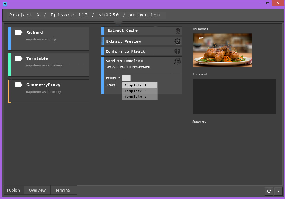
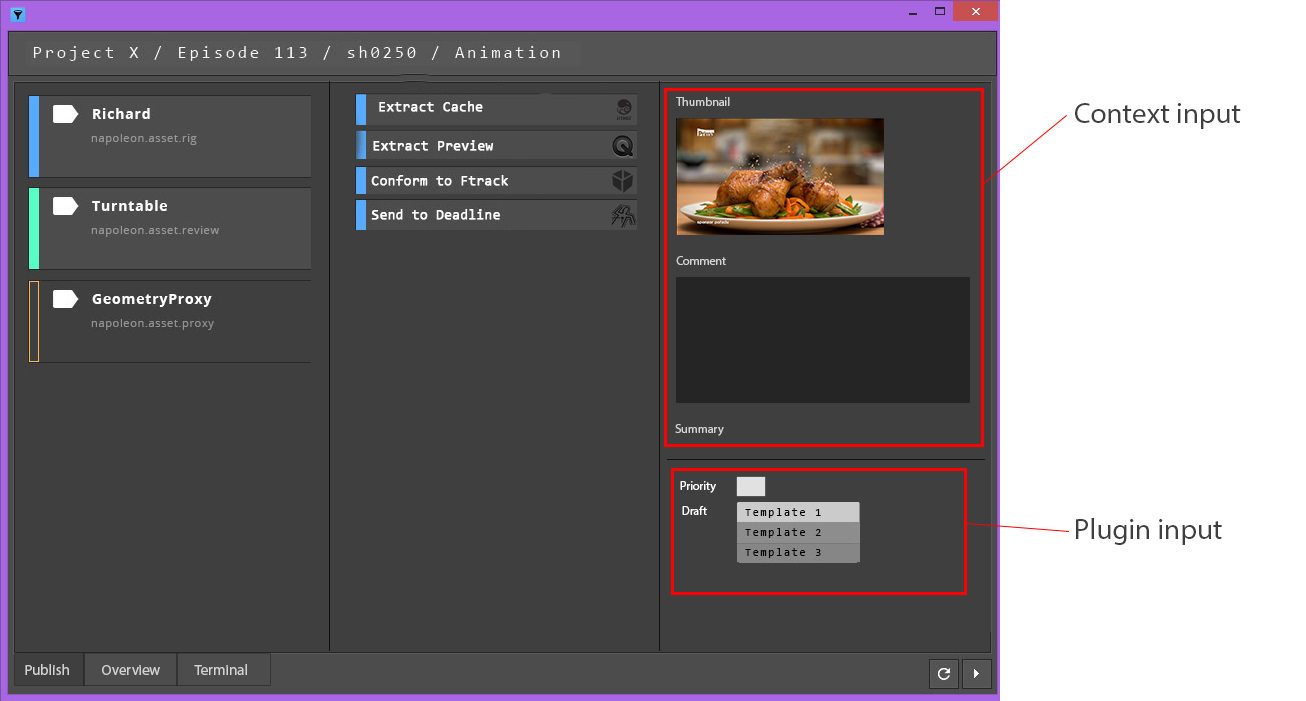
Here’s an ugly mockup so take it with a pinch of salt.
Left - Instances and maybe basic info about them.
Middle - Optional plugins and those that developer specificaly marks as visible. (or the other way. showing all and giving option to hide from UI when writing plugin)
Right - Additional publish info. Ideally Each of of these might be a plugin, so we could populate it with what we want. This could be shared the same way as plugins now. This would require giving developer an option to choose how such plugin would show up in the GUI (image box, text box, button as other plugins…) This is probably a feature on it’s own that would need to be discussed, but hopefully you get the jist.
In case of failed plugins, we could either roll them out from the bottom, just switch to the overview tab, that could look the same as publishing now, where these could be dealt with.
Great suggestions everyone. About this last one, I like the minimalism of it, but don’t you think it can get a little bit confusing, or even frustrating seeing things pop up you didn’t know were there?
I agree with @tokejepsen here. Artist really don’t need to know what is being validated, unless it fails. Best case scenario, where artist had a a very clean scene, it gets published without bothering him at all. Worst case, he gets a list of things he needs to deal with.
Maybe I’d add a little status bar on the bottom, which would just print what is being done currently so he get’s progress of publish in some way. You can seen what is being processed now by it being highlighted in the UI, so equivalent of that. Just so it doesn’t look frozen if everything goes well and it takes a while.
I’ll plus 1 this too, having recently had some experience with this from an artist’s perspective, I can see how most things in that list are a nuisance unless they need my attention.
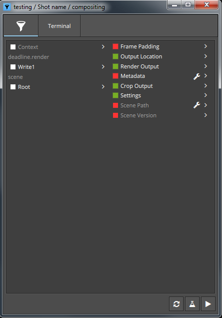
As a hint, I think implementing this should be very simple; the mechanics of hiding and showing items dynamically based on their data within the model is already there (it’s what happens when there are no supported families, for example), and the data already being updated.
It’s done through a “proxy” that either includes or excludes items based on their data, so you could simply add another filter to it to only include items with it’s data hasError set to true.
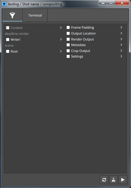
Either way is good. I think right now, the Overview is sort of a mix between two ideals; one where we see everything, and one where we only see what is relevant at the time.
If we go the route of slimming down the overview to only showing relevant things, and making a new view for the more “expanded view”, or if we go the other way around, making a new view for relevant things, I think both are good paths to take. Whichever is simpler to implement might make sense to implement first.
I posted this elsewhere but should reference it here as well: Simpler GUI mockup
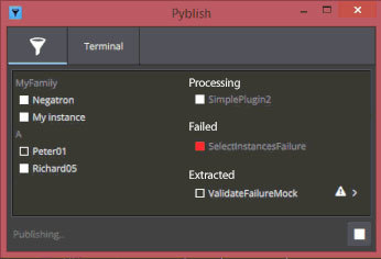
A simpler overview for the artists:
The overall idea is:
Remove the notion of the “Context” in that view.
Show only the currently running plug-in instead of the complete list
This would show on the right side under a header like Processing... or even related to the plug-in type that’s being run, like Collecting..., Validating..., Extracting...
Show only the failed plug-ins (or those that require attention of the artist in any other way)
Similarly whatever got extracted might be of use to the artist, so the “Extracted” content could be shown.
The overall “feel” is very similar to the current more verbose overview to hopefully allow transfer most of the features implemented. Like actions and alike.
Still allow artists to enable/disable an instance. (Again in a similar “view” as it is currently so the “toggle all” functionality could likely transfer here too)
I think it’s important to:
Reduce the overall size/complexity of the UI required to show the information the artists need. (So less clutter, unnecessary information or too technical verbosity)
Less is more.
This would be an additional tab that runs as the default one.
As such more in-depth debugging could still be done.
Like @BigRoy suggested, the tabs would provide access to the current overview and this could serve as a landing page.
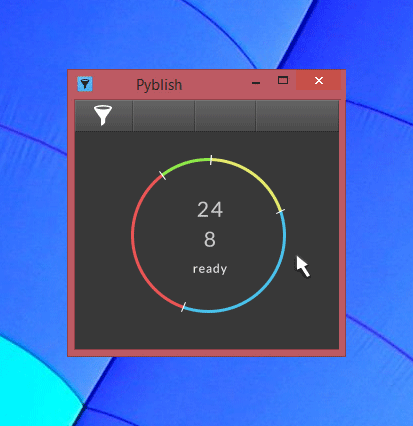
Some of the things happening in the gif.
It starts by showing you how many plug-ins, and many instances. 24 and 8 respectively. A tooltip could potentially display that that’s what the number represents, and isn’t something I think needs to be permanently stated as a label or such to the numbers.
Inside the circle is the info and interactive area, it shows briefly what it is doing or what will happen if you click it.
The colors around the circle illustrates the division of Collectors, Validator, Extractors and Integrators respectively; the Yellow section filling up during reset.
The timer at the bottom shows time passed and expected time to finish. It’ll have to do this based on averaging prior publishes, something we can have a look at now, since @tokejepsen implemented callbacks and we can now start storing things in the host.
On failures, red flags appear
Each flag illustrating a plug-in that fails
Each flag when hovered displays a message in the inner circle
Right-clicking a flag brings up the actions for that plug-in.
Hovering a colored section tells you how many plug-ins are in that particular segment.
Thoughts
As I was making this, it occurred to me that a straight-line version might be an interesting alternative. It would feature the exact same thing, but either be a horizontal or vertical line, where the rest of the GUI would be populated with the status messages, and probably do a better job at it too.
Maybe they could each have a little white checkable flag? Filled versus hollow for checked status.
Or maybe, when you hover that portion of the circle, checkboxes could appear where there are optional plug-ins?
Somehow I’m completely missing what the artist would still want to manage/see easily, like the toggling of instances so they know there work is “processed” like they think it is. (For example seeing rig / Peter01). Just some basic reassurance of what will be processed before clicking “Play”.
I’m also thinking the Artist cares less about the amount of Plug-ins that will be run, but more about what Instances are processed for what “family” (and for them they are not interested in “family” since they won’t know what it means without some Pyblish background). They would be interested in what’s processed and does it process and produce the output I’m expected to create from my work file.
Even though I love the look of this I’m imagining this particular one to be a “sidebar” kind of thing or one that would be nice for something that processes in the background: Just a “ok it’s processing” feeling than something you would open up to investigate for seeing the information. Does that make sens?
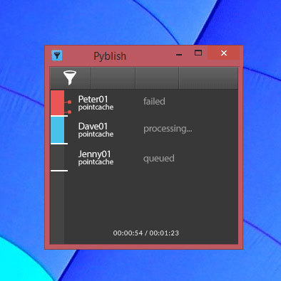
Here’s another minimal mockup based on your circular one. This kind of provides the information that I’m assuming the artist is looking for.
Still I’m thinking that the features like “toggle all” for a specific family was added based on Artist’s requests. So even in the minimal form I’d opt for a structure (or layout) that would allow you to see them “grouped” by family where you’d be able to click the family and toggle all…
What I think is the minimum that needs to be in the ‘artist’ view. When it opens up
List of instances and ability to toggle them on and off. (practically the same as instances now, but maybe nicer design.)
Any optional extractors
When it runs
progress bar, ideally stating what it’s just doing
After it finishes
Any failed plugins so we can run actions on them, look at the problems and deal with them.
Actually concerning the plugins that show up in the ‘artist’ view. A simple flag in the plugin stating if it should show might be ideal. artist_view = True just like we use order, optional etc. That way developer could control what the artist will see. I might want to show them for example extractors that get the main data out as .abc, .obj. .ma, where some of those might be optional but not necessarily.